CAMPAIGN 2016: WHO'S WINNING THE LOGO WARS?
/Chris Christie’s long-anticipated presidential campaign announcement, delayed due to a traffic tie-up in New Jersey, has finally arrived. He joins a multitude of candidates who have thrown their bumper stickers into the ring. Even Donald Trump found time from being really rich to enter the fray. So what does Election '16 look-and-feel like? Let’s find out.

Barack Obama’s 2008 campaign made history by turning the font “Gotham” into a household word. People who knew nothing about typefaces or design now know Gotham when they see it. It didn’t hurt that, aside from the bold, unfussy font was a graphic metaphor for Obama’s vision for America: a sun rising over the American horizon. This icon could stand on its own, with nary an Obama to be found. An ‘O’ representing the world turned one human being into a groundbreaking marketing brand.
Eight years later, where has that revolutionary design taken us? The current crop of campaign creative is a cornucopia of confusing or just plain convoluted communications. From that sentence, you can tell I have an affinity for alliteration. So let's start with Perry and Pataki.

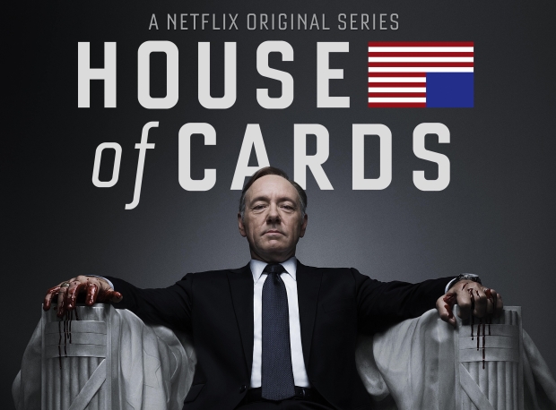
RICK PERRY and GEORGE PATAKI both leverage their inherent plosives, and why not? Pataki for President flows trippingly enough, though Perry President just kind of trips and stumbles. President Perry would read more fluidly, and that structure would lend his quest a sense of fait accompli. Pataki sports a starless flag (and upright variation on House of Cards), whereas within Perry’s life preserver design resides a lone star resembling fireworks at full bloom just before flaming out.

TED CRUZ, LINDSEY GRAHAM and LINCOLN CHAFEE each employ serif fonts to some degree, a choice that comes off more precious than assertive. Cruz adds an American flame which can either suggest a glowing beacon of hope that is America or, considering his deep religiosity, represent America's going to hell in a hand basket. Graham, with a 16 – sans apostrophe – above his name, looks less like a logo and more like an address plate you might find on a Georgetown townhouse. Chafee tries to have it both ways, with a serif Lincoln and sans serif Chafee but all that does is tell us that even he doesn’t know who he is. So who is this candidate Lincoln Chafee? Well, he’s got some ‘Fresh Ideas for America,’ in a typeface that's largely unreadable. One of those fresh ideas, apparently, is to include green rules in an American political logo design. Is that a subliminal message directed at Wall Street? Or, with all that freshness, an appeal to organic farmers?
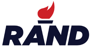
RAND PAUL goes simply by the more familiar Rand, crowned by a torch and set in a bold font and stark red, white and black color palette. The overall effect suggests something more appropriate to industry than politics (a confluence that is likely intentional). Think Rand Industries, with the flame representing factory burn-off.

CARLY FIORINA, BOBBY JINDAL and MIKE HUCKABEE have made stars a centerpiece of their brand identity, as opposed to others who use it as mere adornment. Perry’s star is central to his logo as well, but the design is so busy overall that the star is just one of a number of elements demanding our attention. In contrast, Carly's single red star effectively draws our focus, and the thin, clean and – dare I say, feminine? – font makes for a unique and recognizable logo, albeit somewhat reminiscent of an Uber plaque. What it doesn't do is inspire. Another one-name-wonder, this execution further ignores the fact that she's not the only Carly in the world, as my 10 year old son pointed out when he asked, “I Carly is running for president?” In that light, it could be seen as a brilliant appeal to the youth vote.

Bobby Jindal reminds us that Jindal begins with a 'J' represented either by an inverted Louisiana boot or symbolic assertion that the candidate plans to give America a good swift kick in the pants. Like Obama and Hillary (discussed below), Bobby understands the appeal of a symbol as visual cue. But great icons tell a unique story, and this one could just as easily serve Jeb as Jindal. The mix of light and bold lettering in various shades and colors doesn't help.

Huckabee’s stars appear to be shooting and falling - and yellow? - while other elements, including the tagline, are plagiaristic. It borrows from Bank of America’s red, white and blue waves of grain, and language from the original Man from Hope (Bill Clinton, for you kids out there) and Obama, by way of Shepard Fairey's "Hope" poster. Higher Ground, of course, has religious connotations appropriate for a minister, but is also defined, according to Webster’s, as “a position of advantage or superiority; esp. an ethically superior position.” When it comes to sanctimony, Santorum’s got his work cut out for him.
Huckabee's announcement was kicked off with a performance of the 1973 anthem "Tie A Yellow Ribbon" by the song's originator, Tony Orlando. As many of Huckabee's positions embrace a behind-the-times nostalgia, perhaps his logo should be more blatantly retro. Here's my submission:


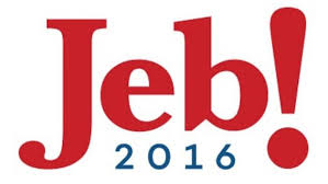
BERNIE SANDERS' and JEB BUSH’s logos (along with Carly's and Rand’s) raise an age-old question: are voters more likely to go with a pal they’re on a first name basis with, or a candidate whose gravitas is expressed in the formality of a last name? Do we want a president we’d have over for dinner, or one who will help us put dinner on the table? Does the first name make them more accessible or reduce them to children? “Jeb!” No answer. “Jeb!” No answer. “What’s gone with that boy, I wonder? You JEB! Whitewash that fence, and get that whippersnapper Bernie to help ya!”.
Like the candidate, the Bernie logo has a free-wheeling air about it and reminds us that elections can be fun. One can appreciate Jeb!'s effort to disassociate himself from the name Bush, though the execution goes cartoonishly awry. Al Gore famously sought to distance himself from Bill Clinton, but rarely does one see - as in Jeb!'s case - a candidate so strenuously distancing himself from his own name.
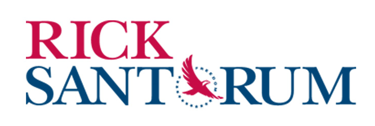
RICK SANTORUM maintains sole possession of America’s bird of prey iconography, whose vicious raptor quality was laid bare by The Colbert Report years ago. The bald eagle, second cousin to the vulture, may well be the perfect symbol of Rick’s sanctimony: he’s not just coming for your vote, but straight for your heart and soul.

MARCO RUBIO one-ups Santorum in the American icon category, dotting his i with a teeny weeny silhouette of the US. Unfortunately, what it really suggests is an America with a big stick up its ass, which may appeal to a certain stripe of conservative voter. His name is set entirely in lower case and an argument can be made that if your name doesn’t deserve capital letters, the nation's capital doesn’t deserve you. Little America. Little letters. Little chance for success.
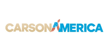
BEN CARSON has adopted the look of a superhero: CarsonAmerica! (If you’re a morning TV watcher, you may also be reminded of Good Morning America’s logo.) Sandwiched between his first name (Carson) and last name (America) the A alludes to (rips off?) Lynda Carter’s Wonder Woman blue, star-spangled hot pants. Look up in the sky. It's a bird. It's a plane. It's a...neurosurgeon!
Note: Late yesterday afternoon Bloomberg's Ali Elkin reported that Carson has replaced his CarsonAmerica logo with a more straightforward type treatment, and an AMA-approved tagline: Heal + Inspire + Revive. Much better...but this one is much more fun to talk about.
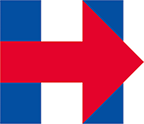
Moments after HILLARY CLINTON released her logo I tweeted a snarky “Hospital, next exit” remark, and my opinion of it hasn't changed. I keep squinting, hoping to find a secondary element, another layer of meaning, a la FedEx's arrow, but none appears. I don’t know what this icon is trying to tell me, other than the candidate hopes to move the country to the right, which is likely not the message she wants to convey. (Or is it?) Bernie’s candidacy and the pressure it puts on Clinton only further confuses the Hillary brand. But hey, it’s not like her people didn’t have enough time to work on this.

DONALD TRUMP. There are too many easy jokes to make here. Stop me if you've heard this one: "Hey, Donald? Want to make America great again? Move." But I digress. Trump's campaign logo is merely an extension of his global brand, telegraphing a view that the presidency would be just one more business deal in his portfolio. But the electorate isn't a staff to be hired and fired, and Donald Trump is nobody's idea of a civil servant. On a positive note, The Donald is being entirely up front; he seems to be saying, 'If you like the way my name glows from the tops of so many ugly buildings, just wait till you see how it looks big and bright over the White House.'

No branding of the current campaign better reflects its candidate than Chris Christie's. The typeface is big and bold and round and - at the risk of being labeled weightist - fat. But it's the tagline that best expresses who this man is: Telling It Like It Is. Love him or hate him, believe him or not, at least he believes himself to be the unabashed, unapologetic anti-politician willing to speak truth to the powerless because, in the words of Barry Goldwater and in the mind of Chris Christie, 'In your heart you know I'm right'. It also reveals much about his ego: this isn't about you, or America, or his vision for America. It's all about him...talking. Such brash honesty is refreshing, after so many attempts that either try too hard or hardly try. It's the kind of forthrightness that can only come from a candidate who knows he doesn't stand a chance.